Alternatives to Business Process Modelling Notation – BPMN
Business process modelling notation, or BPMN as it’s commonly known, refers to a precise notation for documenting business processes designed to remove the ambiguity of textual process specifications by depicting the sequence of business processes visually as an information flow.
It is similar to the Universal Process Notation (UPN) we use here at Skore, another visual methodology, but there are some key differences we will explore today as we conduct an in-depth analysis of BPMN.
How Is BPMN Helpful?
Business map processes to find out how things are working, to document how, and to then search for ways to improve it.
BPMN’s big selling point to do so is that it provides one unifying notation for all processes. In this way, all business stakeholders can understand the charts and flows.
BPMN helps organisations understand and document their business processes to identify key areas for improvement. The notations utilised by BPMN in their business process diagrams are comprehensive and rich, there are a wide range of shapes and symbols at your disposal to enrich your diagrams.
And the industry standard is developed by the Object Management Group (OMG) consortium since 2005, a not-for-profit industry group that ensures the standardization of the notation and processes is maintained. It means there is someone overseeing it constantly, and that business can turn to it if they are confused at any point.
Once the entire process is captured on a diagram, businesses can begin to analyse where they can improve upon their existing methods. Where they can switch up their spending or time management to avoid unnecessary expenses or time-consuming tasks and instead boost their revenue.
This does not come without some drawbacks, however.
What Are the Limitations of Business Process Modelling Notation?
For all that it is helpful, BPMN does have some limitations.
The first problem is the amount of training required for someone to understand and follow along on the chart made using BPMN. In 2016, to know how to use the software tool you needed to download and understand a 7.1 MB PDF of 538 pages. It’s great that BPMN is standardized to avoid confusion, but this type of approach with too specific instructions for symbols and usage will still limit who is actually able to use and understand it.
This is because BPMN can become very visually complex. But then this does not help one efficiently follow along and understand the processes, does it?
Similarly, due to the visual complexity of the charts, a lot of important information ends up missing, and the flows begin to look messy.
For instance, decision diamonds and swim lanes, both parts of BPMN charts, will take up a lot of space on the chart. They will add a lot of new symbols and notations, resulting in the overall understanding of the process becoming more complicated and convoluted than it originally was. And, because there is a lack of space for the amount of information needed to be conveyed, the map can become even larger and more complicated, or information may get lost.
Furthermore, the action boxes in BPMN are based on the owner, while in UPN they are based on the order of action. When performing an analysis, the entire title of the box has to be read to ensure everyone is on the same page, as opposed to simply following along via the next step.
The notation itself also causes confusion. BPMN relies on symbolic precision to communicate actual processes. While machines may respond to symbols, however, humans do not, and there is often room for error and interpretation of certain symbols in a process depending on how they are diagramed and used. In this way, BPMN then suffers from the same drawback as other business process mapping options, despite being touted as the answer to process ambiguity.
BPMN is so structured that you lose out on context at times, and by relying on the symbols you end up running into the same issue as before. A visually complex diagram can sometimes have multiple interpretations and a lack of additional context for each process.
What Are Some Alternatives to BPMN?
Given the issues with BPMN, let’s explore the alternatives.
The first option would be to turn to BPMN’s origin, the Unified Modeling Language (UML) diagram. Originally created for software development, UML is the base of BPMN. The main problem is that there are fourteen different versions of this diagram, and selecting the right one and then communicating it to anyone that is not an expert or familiar with UML becomes a problem. While UML has been acknowledged as great for object-oriented processes, when it comes to larger business processes BPMN is the natural successor. And UPN is then the natural successor of BPMN, as we will find out.
You can also always return to a good, old-fashioned flowchart. The precursor to all of the diagrams we are talking about, flowcharts continue to exist and be useful for a reason. But when it comes to mapping out business processes, flowcharts can get messy and illegible very quickly. As they rely on sequential sequences of events, flowcharts fail to account for parallel activities or previous activities that are also part of larger processes. And in a large company, a lot of processes have parallel events that need to be documented to ensure everyone knows what is happening.
Data flow diagrams (DFDs), which were developed in the seventies, are used to capture how data flows in an organisation. They do not strictly work for business processes, as they are not exactly a flow or step-by-step diagram, but they do capture how data is working within an organisation. You might find a use for them if your business is driven by data, or perhaps as an analytical tool for a specific process within your business to understand how data is flowing.
Gantt charts have also been around for a while – since the late nineteenth century in fact. These charts focus on deadlines, by creating subtasks to a larger task with specific time frames. They are still used by some companies for processes that are time sensitive to organise themselves, and they have also been known to be used in academic circles. However, the information presented in them is not exactly a flow, and it is too simplistic to capture the entirety of a complex business process as they exist today.
Program Evaluation Review Technique (PERT) diagrams come to us from the 1950s US Navy. They make use of circles or rectangles, called nodes, to represent project milestones or events. These are then linked by vectors, which correspond to the various tasks required to arrive at that milestone or event. These diagrams break down the individual tasks of a project for analysis and help identify task dependencies. Their main focus is helping the business find the best ways to save time, but as a result of this focus, they can be quite difficult to interpret accurately.
A lot of these alternatives have fed into each other over time, bettering the capture of processes slowly but surely. This brings us to the twenty-first-century option, UPN.
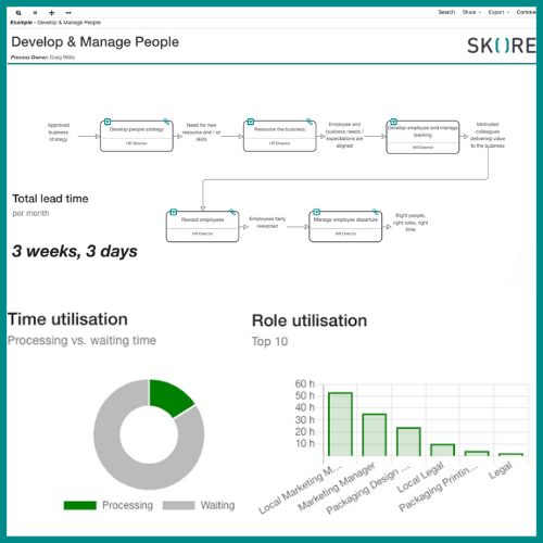
We’ve mentioned it a few times in this article because UPN is the culmination of all of the needs a business process map has. It provides a simple notation that anyone can follow along to, without the need for an additional long manual about arcane symbols and their meanings. You can present your process simultaneously to your client or stakeholders, and they can all follow along easily.
It has room for parallel processes, and for both big and small picture processes that work together to arrive at the desired result for the company. And despite this, the charts and diagrams in UPN do not become overly crowded or complex. Instead, they still are presented in a way that simplifies and deconstructs processes down to the basics.
The boxes in UPN maps are also organised by action steps, making it easy to follow along and avoid any possible confusion about where to go next.
UPN works with a computer in mind. Software makes it possible to add smaller parts of processes as subcategories that can be accessed at specific points in the process, decluttering from the larger picture and leaving everything streamlined for the viewer.
We selected UPN as our business process mapping base at Skore because it provides so much clarity for us, and we wanted to share it with our clients. Your business processes are complex, but they can be broken down into small, actionable steps that you and your team can follow along on without needing to consult a manual about symbols constantly.
Skore also allows for smaller processes to be incorporated into the diagram, and for the attachment of additional informative documents to all the steps. And we focus on answering the questions of what, who, how and when in our diagrams, as we ensure accountability and responsibility is built into the process.
With UPN and Skore, long manuals and symbols when it comes to process mapping are a relic of the past. With computers making software the natural choice for business process mapping, simplifying everything further and adding attachments it is the clear next step to the future.
It is also really easy for the business to understand your process map and get sign-off from stakeholders easily. You can do a bird’s eye view analysis or drill down to the detail at the click of a button. You can also map at the speed of conversation in a workshop rather than having to spend your evenings mapping out after the event when you are tired or forgetful. With Skore you can also get reporting and analytics.
Conclusion
We’ve explored and learned about BPMN, its uses, drawbacks, and why UPN is the best alternative in the market today.
Keeping it simple when it comes to business processes is always best, and UPN captures that notion more than any other diagram available yet.
It is for this reason that Skore relies on UPN for its business process modeling, as we have found it is a game-changing communication tool for companies about their processes, both internally and externally to their own clients.
Want to learn more? Book your demo today to take a look for yourself!

